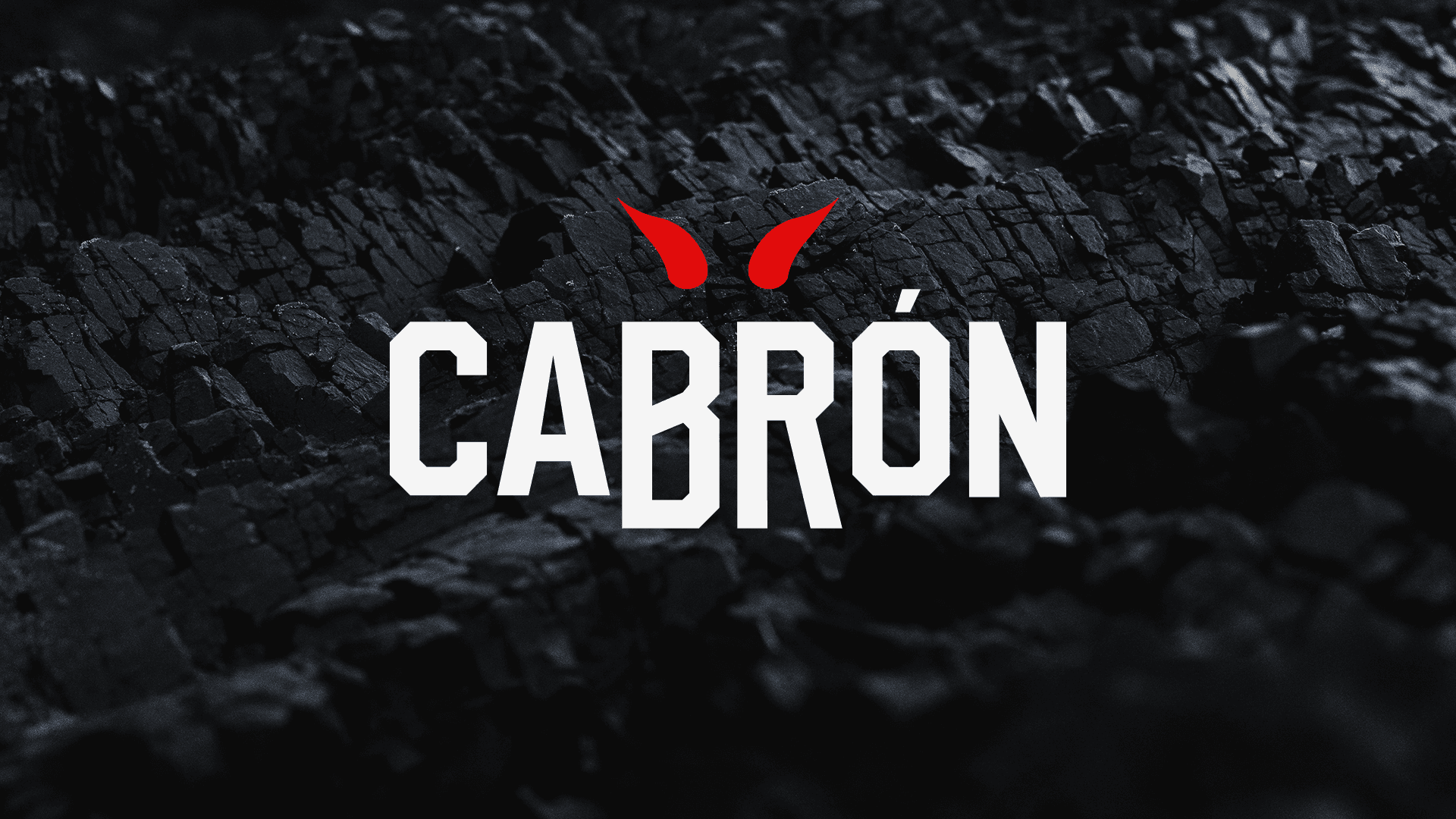
Cabrón
What it is
Personal branding/packaging concept for a Chilean charcoal line. Scope: naming, customized wordmark, horn mark, color/type system, information hierarchy, and photo direction. Brand direction: bold, slightly irreverent, grounded in the essentials of fire and material.
Identity
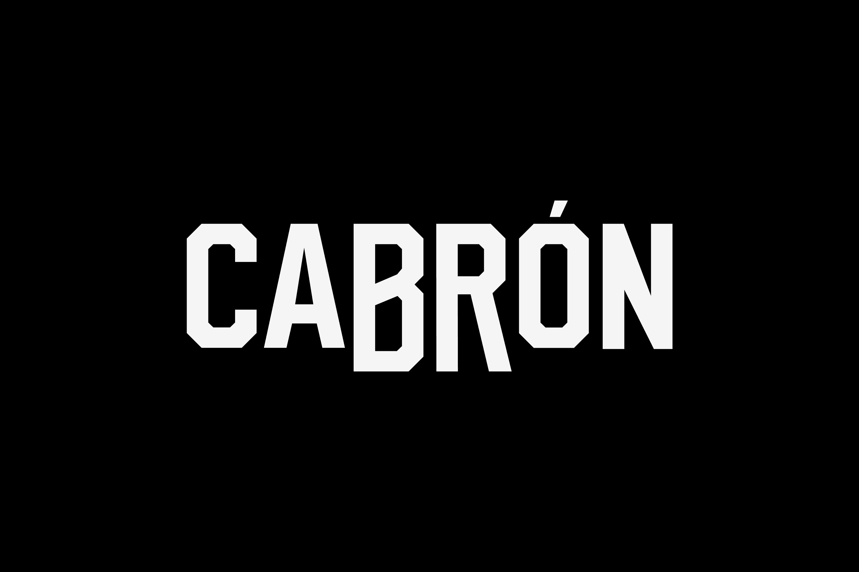
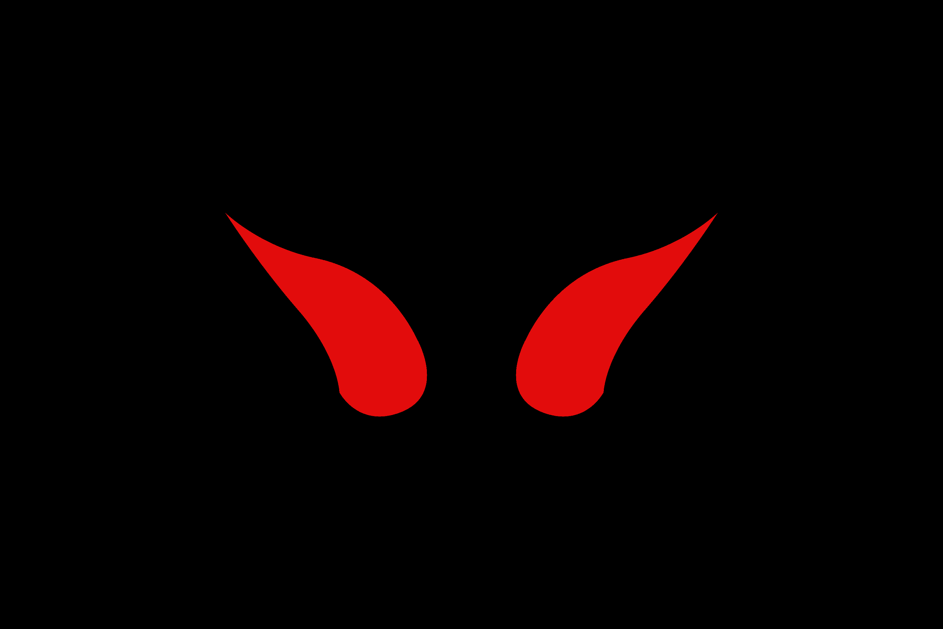
Wordmark based on Hudson NY and customized for a denser rhythm with flat cuts that echo charcoal facets. The horn mark reads first as attitude and also as an ignition gesture; the pair balances recognition and utility at small sizes.
Color & type
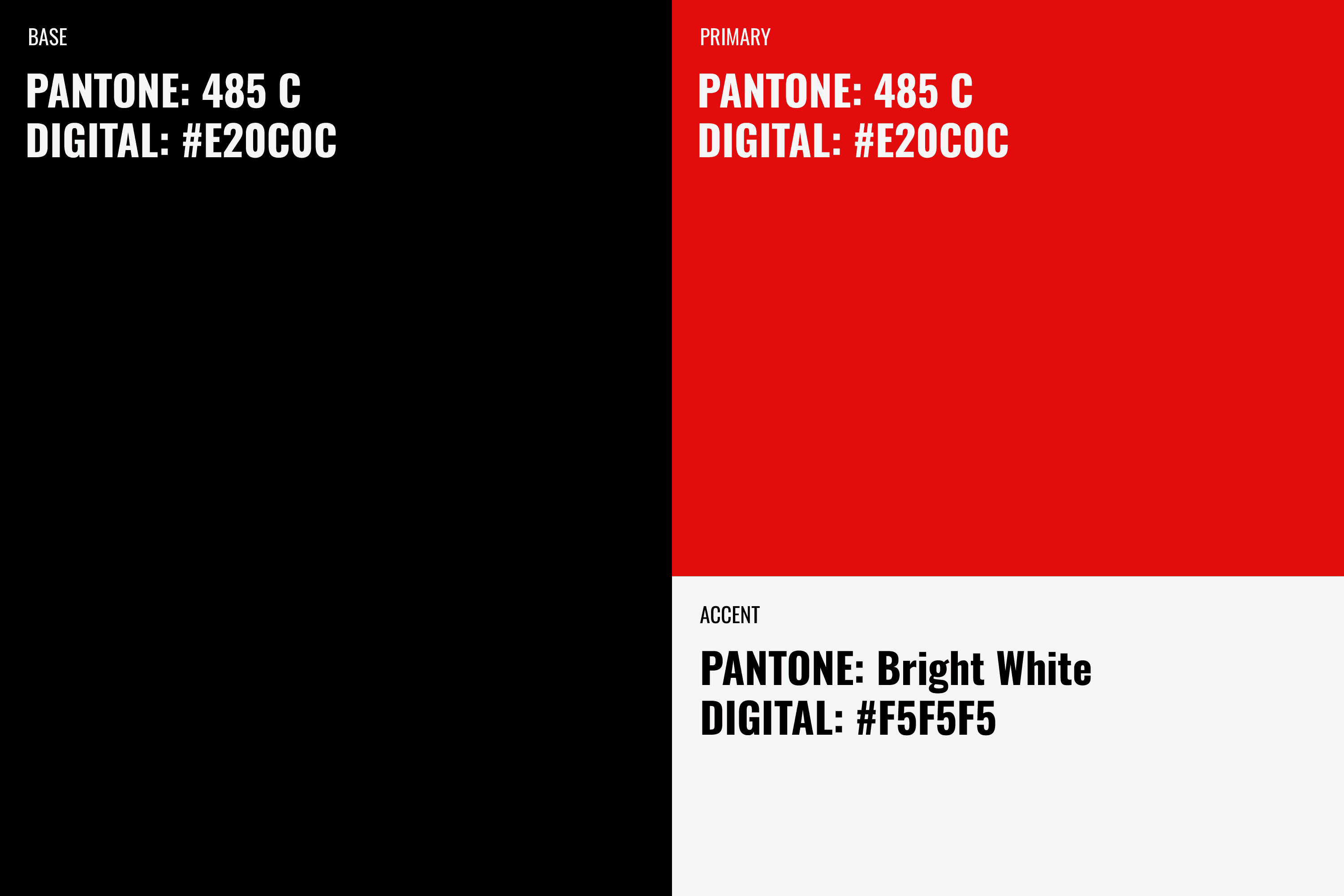
Palette: black base, red as primary, white as accent. Typography: Oswald for auxiliary/body copy; the customized Hudson NY wordmark for display and primary branding moments.
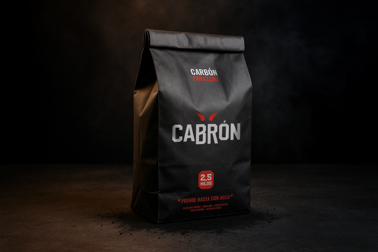
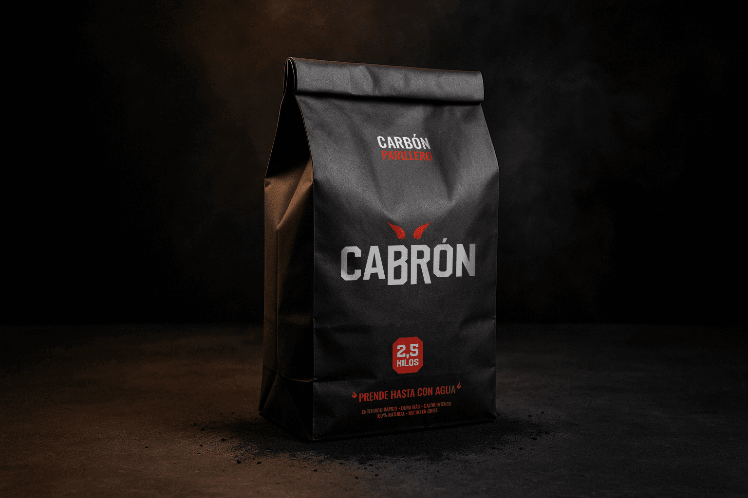
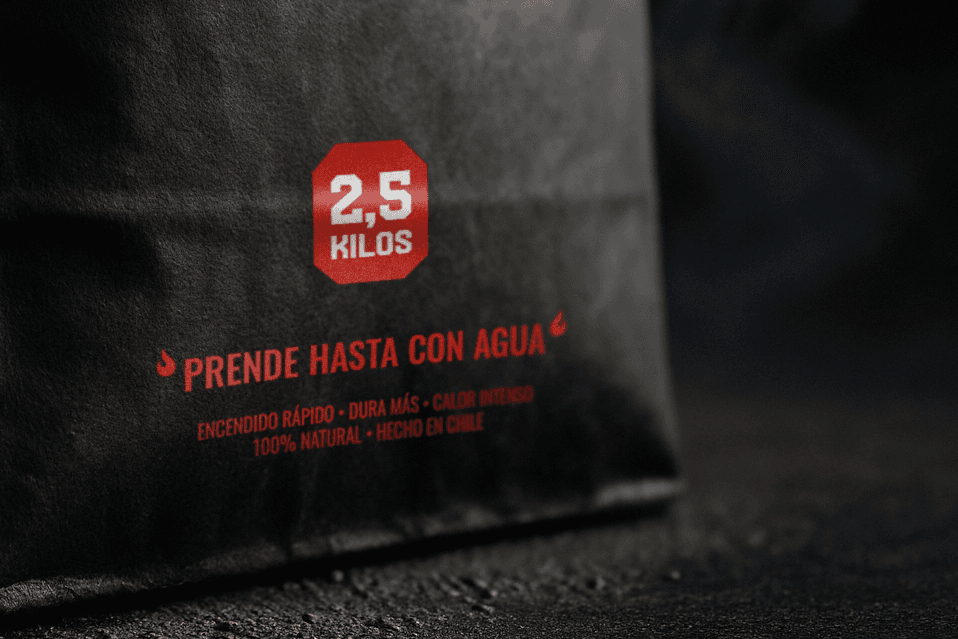
Packaging hero
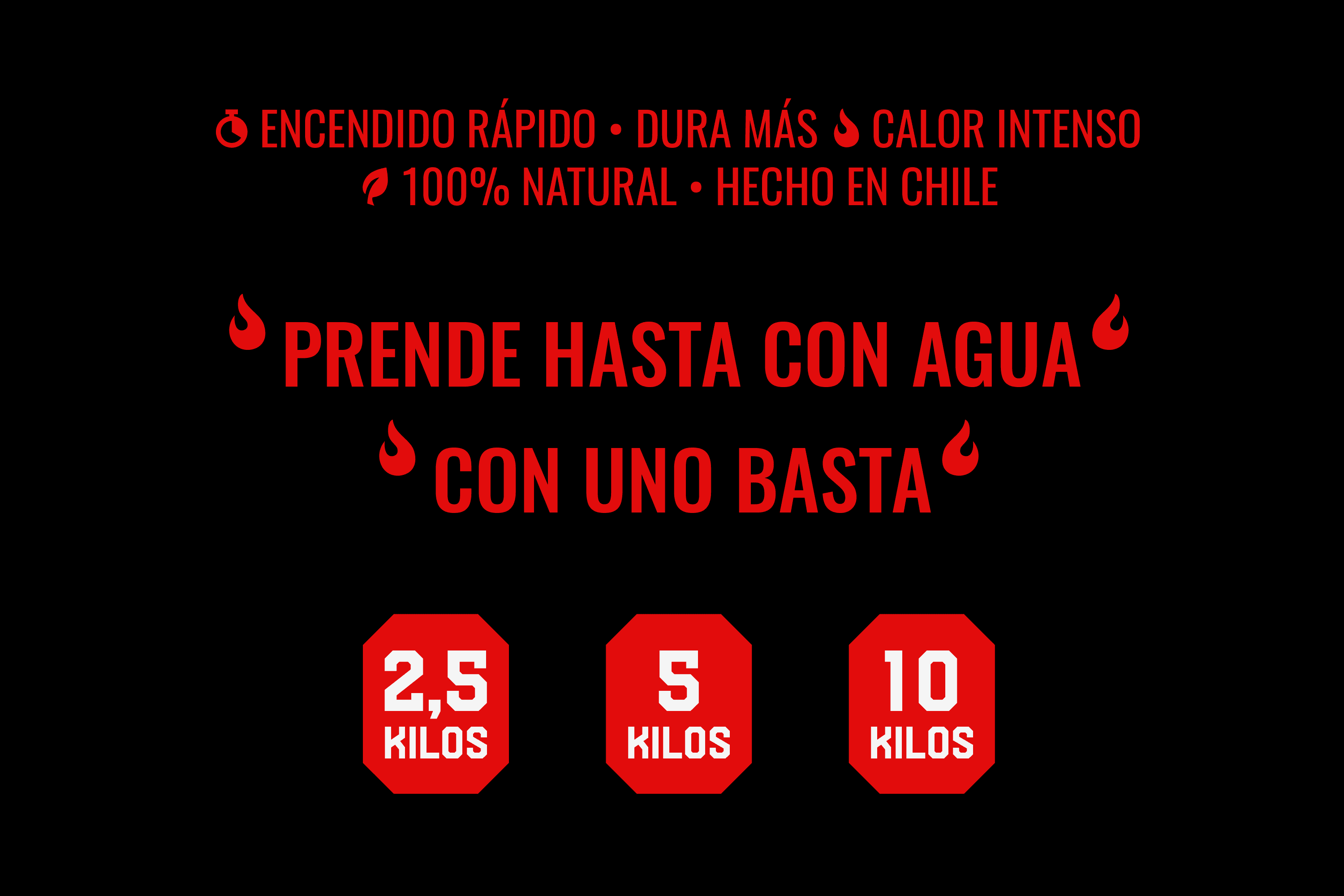
Front panel organized for quick read: brand first, weight second, then a concise promise. Minimal elements keep the shelf read clean.
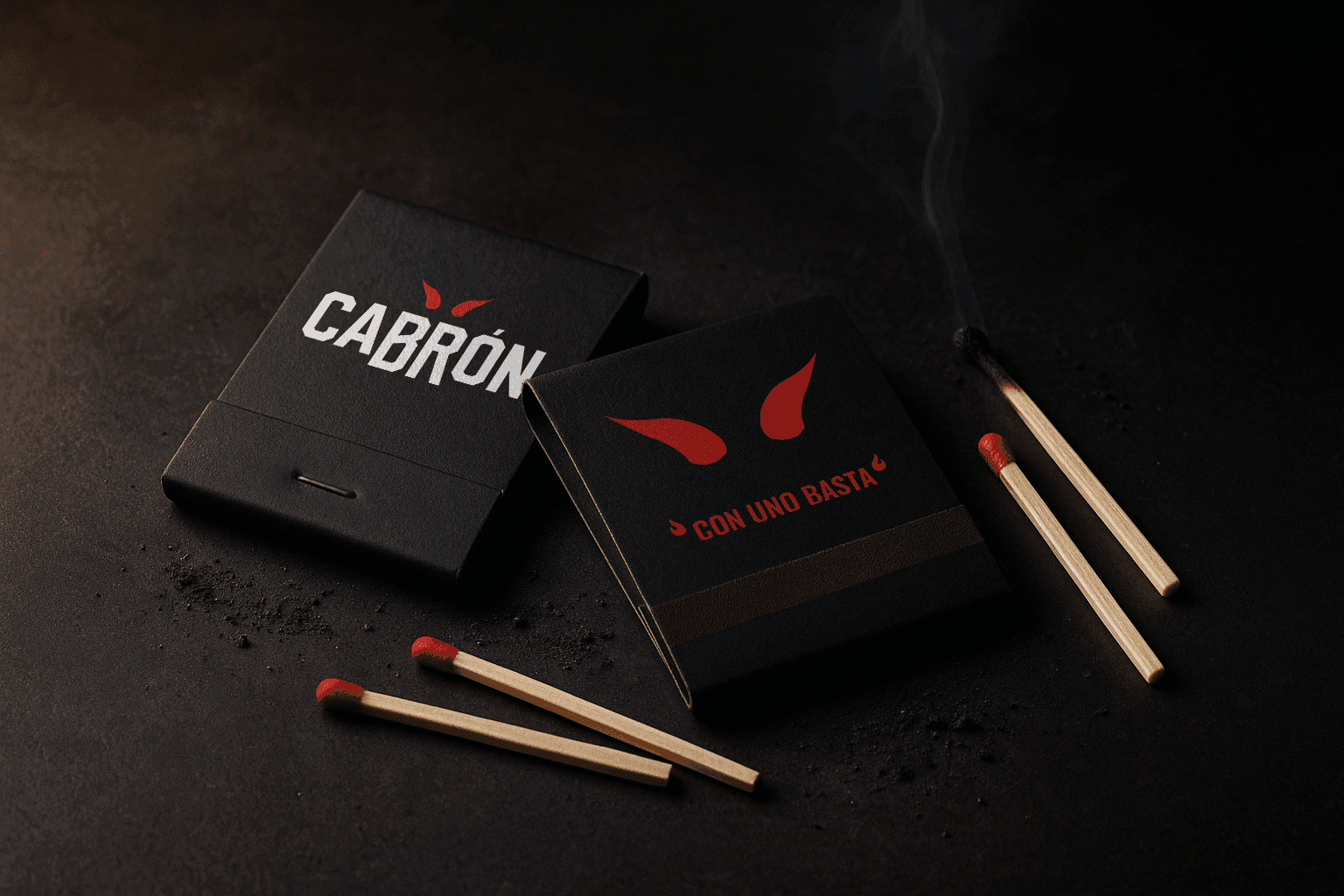
Brand extensions
Matchbooks test the identity at small scale. Short, direct copy keeps the tone consistent.
Outcome
Naming, modified wordmark, symbol, color/type guidelines, and a packaging hierarchy explored through hero, macro, and accessory shots. Concept-stage work aimed at clarity, cohesion, and scalability.