Registro Civil
Overview
RegistroCivil.cl is one of Chile’s most widely used public service platforms. It centralizes identity and civil-status services, digital certificates, and appointment scheduling. Because many procedures require ClaveÚnica — the country’s digital identity credential — the platform is critical to millions of residents and Chileans abroad. This redesign was my capstone project, where I led the entire process end-to-end: research, heuristic evaluation, surveys, IA redesign, wireframing, UI system, prototyping, and usability testing.
The problem
Although the site handles essential tasks, its experience had grown fragmented and inconsistent. Users struggled with: Unclear appointment availability and low visibility of confirmations. Repeated data entry, especially with ClaveÚnica and personal details. Disjointed navigation between domains (Registro Civil, ChileAtiende), breaking flow. Poor information hierarchy, with mixed categories and action labels that did not match user mental models. The result: longer task times, unnecessary errors, and significant drop-off during key procedures.
Heuristic Evaluation
I evaluated the platform using Nielsen’s 10 heuristics and relevant UX laws (Fitts, Miller, Jakob’s Law, Von Restorff, Aesthetic-Usability Effect). Key findings included: Fragmented login and no way to undo or edit steps (Control & Freedom). Inconsistent labeling and mixed icon styles (Consistency & Standards). Small action targets, especially critical buttons (Fitts’ Law). Overloaded pages with dozens of items and no categorization (Miller’s Law). Red used for low-priority actions, hurting visual hierarchy (Von Restorff).


Survey (40 respondents)
Goals: understand user behavior, trust, and pain points. Insights: 75% had used the site in the last 6 months. 73% took more than 5 minutes to complete their last task. Nearly half had to repeat steps or re-enter data. One-third struggled to compare offices and appointment times. Users described the experience as “starting from zero every time.”

Tree testing
Two tasks: find a birth certificate and book an ID renewal appointment. Results showed deep navigation mismatches: 50% success for certificate flow, and only 20% for appointments. Most failures originated from misleading labels (e.g., ‘Trámites’ acting as a guide instead of an actionable section).


Design Goals
From the research, I established four goals: Reduce repetition through unified login and data persistence. Align navigation with user objectives, not internal categories. Simplify appointment scheduling with filters, maps, and clearer availability. Create a consistent, accessible visual system that matches government standards.
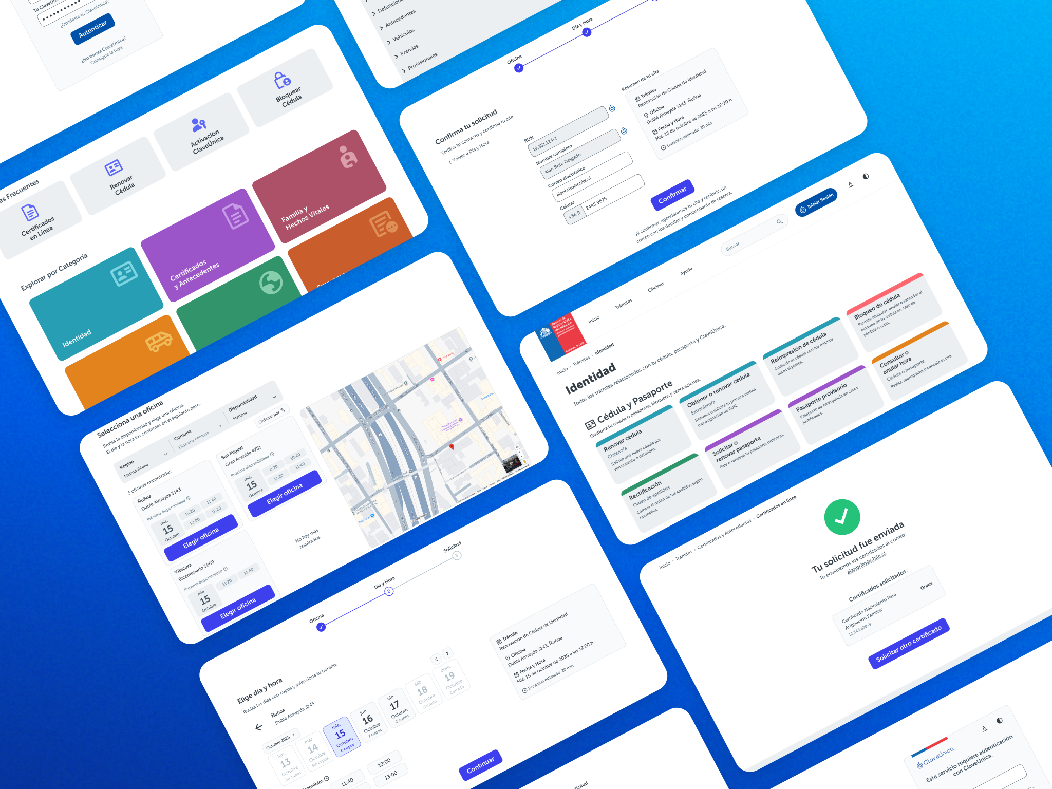
Information architecture
The IA was reorganized around user goals, not actions. Examples: “Cédula de Identidad” replaces “Agendar Hora” as the entry point. Certificates, appointments, and identity services are grouped by intention. The misleading “Trámites” label was replaced, eliminating a major source of failed navigation. I also added: Shortcuts for high-frequency tasks Integrated explanations directly inside user flows, instead of sending users to separate pages Clear hierarchy for pages containing legal or process information


Interaction & Flow Improvements
Reduced steps to five. Added autofill where appropriate. Consolidated instructions and action into one screen. Appointment Scheduling Added filters (city, region, morning/afternoon, “next available”). Introduced a map view to compare offices visually. Made availability more transparent and easier to scan. UI & Design System I built a complete UI kit inspired by government guidelines: Museo Sans for legibility and institutional coherence. 12-column layout for responsive behavior. Accessible color palette with semantic states (success, warning, error). Material Design iconography with unified style. Components for forms, buttons, navigation, pop-ups, breadcrumbs, search, and date pickers. I also defined voice and tone guidelines: clear, brief, neutral, and formally correct — essential for government services.


Usability testing
I conducted 4 moderated and 10 remote usability tests on both redesigned flows. Results: 100% success on both tasks. Certificate flow: 22 seconds average, down from >1 minute. Appointment flow: 36 seconds average, down significantly from baseline. Key insights: Users preferred starting via shortcuts. The new category-based IA was immediately understood. Combining instructions + action in one page reduced friction. A few users requested more visibility in confirmation screens (easily fixable).
Outcome
The redesign delivered measurable improvements: Clearer navigation aligned to user intent Reduced cognitive load Faster completion of critical tasks Stronger trust through consistent UI and integrated help Better accessibility and mobile responsiveness This project demonstrated how UX design can elevate public digital services by reducing friction and empowering users to complete essential procedures with confidence.
Reflection
Working end-to-end allowed me to understand the full depth of public-sector UX: complex logic, high stakes, broad user diversity, and the need for clarity and trust. Key learnings: Small labeling decisions can drastically influence task success. Integrating information directly into the flow reduces confusion. Accessibility and visual consistency aren’t just aesthetic; they build legitimacy. Public services benefit greatly from transparency in scheduling and availability. If I continued, I would explore: A more advanced appointment system with real-time availability Multilingual support Mobile-first refinements for users with lower digital proficiency